6 Ways to Drive Traffic Away from Your Website

Traffic? Why would you want traffic to your website? Ridiculous viewers and people looking at your website, screwing around with the comments, criticizing you on that post you spent five minutes. Forget them! But how? It’s like whatever you do, users still come to your website.
Never to fear, 16.3 understands your pain. We’re here today to provide ten ways to drive traffic away without seeming like it. For those of you who still want traffic, well, I’ve also included a “but seriously” area below each tip. But why would you want that?
Without further ado, let’s get started. I’m sure you are very eager.
1) Increase the load time of your website.
Of course, nothing gets people to leave faster than having an incredibly long load time. Make sure you decompress your files, leave plenty of comments in that CSS that only two developers will look at.
You’ll lose 20% of your traffic for every extra second after 2 1/2 seconds. Isn’t that great? You’ll lose all your viewers in a jiffy.
But seriously: The above factoid is true. Make sure to compress all your files, sprite your images, and delay non-important scripts.
2) Add a fake loading bar!
If your browsers still display “Done.” at the bottom in a flash even though you’ve increased the file sizes, well, don’t fear. Add a fake loading bar. Show a nice slow loading bar. Make it jumpy to be even more realistic.
Tell your visitors that you are sorry for the inconvenience, but at the same time snicker in your ingeniousness. Your viewers will never know that the entire page is already done loading.
But seriously: Don’t add fake loading bars unless a) the page is really not done loading, or b) it is necessary to provide usability features. For example, one view to another is uncomfortable. Provide a quick loading bar to offer your viewers a jump between the two views.
3) Provide a nice splash screen.
When your users finally finish waiting for that fake loading bar, surprise them with a beautiful splash screen. Animate it to your best. Since your users (probably) have Flash and (most likely) have speakers, create a nice animation that is similar to PowerPoint animations and add some music.
This is also a great place to add advertisements. Time are tough.
But seriously: Users get annoyed by splash screens. So don’t.
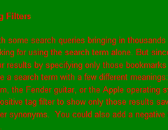
4) Try a new color scheme: green on red.
 Do it, I dare you! Place a notice at the top (with red on green, naturally) stating that you are going to celebrate Christmas ten months early by giving your viewers a gorgeous new color scheme.
Your readers will absolutely love that you are a great person. For bonus points, throw in some automatically playing Christmas music. They’ll all sing along in their joy and bring up your site whenever they need some Christmas cheer in the middle of April. How’s that for website-reader relations?
But seriously: Be sure your colors are readable. Don’t use directly contrasting colors. Give your readers a break. And please don’t auto-play music on your website.
5) Reduce the font size and line height, and increase the width of each line.
Make sure that the font size is below 8 pixels, and the line height at 7 pixels. Make the length of each line 100% of the browser width so they can track it all the way across the screen. When your (remaining) users cry for mercy, tell them to visit the eye doctor. How’s that for helping your users? You’re offering them medical advice!
But seriously: Line height should be above 175%. Each line should contain maximum 600 characters. Font size should be 13px or more (use odd numbers for sharpness).
6) Do you want to read my content? Well, too bad.
 Did your viewers come to your website for content? Well, you come to your website for money. Load in the advertisements at the top of the page. Be sure to monetize every single bit of your website. You can earn the most money when your advertisements are all above the fold, so do that!
Offer your unsuspecting readers a “skip down” button. When they click it, trigger a few pop-ups and a few pop-unders. Of course they will want a free laptop (conditions apply). As they scroll down, float a few more ads, then fade out the entire page to show an ad.
But seriously: You may actually go to your website for money, but that’s not what readers come for. Put your content before your ads. Everyone will be happier.
Overall: Please don’t do any of this.
Please. Please. Please. For the sake of humanity and your customers.